如何准确表达SCI论文中的图?
SCI论文的Results and Discussion中有三分之一的文字是用于表达文章中的各种图。
而很多学生恰恰卡在了这看似简单的第一关:图已经做好了,但不知道如何准确的对每张图进行表达。
我也认真准备了这一次回答,在这里总结出了关于SCI论文中插图描述的小小套路,希望可以帮助到各位!
一、 柱状图
柱状图是SCI论文中一种常见的数据表现形式,描述的是分类数据,回答的是每一个分类中『有多少?』这个问题。
1、 构成
- 由几个数据群(系列)组成。
- 构成要素有分类项目、系列项目和固定项目。

2、描述方法
首先描述关键实验结果,接着解释结果产生的原因,然后对结果进行讨论,还需要引用前人的文献进行佐证。
(1)描述关键实验结果
- 描述方法
①固定一个分类,分别描述这个分类中每个系列的变化规律,然后依次描述其他分类;
②固定某个系列,分别描述这个系列中每个类别的变化规律,然后依次描述其他系列。
- 句型模板
As shown in Figure 1,
As can be seen from the p,
From the p above we can see that
It can be seen from the data in Figure 1 that
It is apparent from this p that very few …
In Fig.10, there is a clear trend of decreasing …
From this data, we can see that Study 2 resulted in the lowest value of …
From the data in Figure 9, it is apparent that the length of time left between …
As Table III shows, there is a significant difference (t = -2.15, p = 0.03) between the two groups.
(2)解释结果产生的原因
- 描述方法
假设性的解释,常用不确定性情态动词如“may、might、would等”,这种情况最好有前人的文献支撑;或利用论文中其他图表的数据做支撑,比如柱状图的结果可以用SEM、XRD等图来进行解释。
最好是这两种解释方法都用,以对某一结果进行充分的分析。
- 句型模板
A possible explanation for this might be that …
This result may be explained by the fact that …
There are, however, other possible explanations.
These relationships may partly be explained by …
There are several possible explanations for this result.
A possible explanation for these results may be the lack of adequate …
These differences can be explained in part by the proximity of X and Y.
These factors may explain the relatively good correlation between X and Y.
(3)对结果进行讨论
- 描述方法
描述完实验结果之后,需要对结果进行推论,如可以讨论加入某种物质对材料某种性质的影响。
- 句型模板
This observation may support the hypothesis that …
Hence, it could conceivably be hypothesised that …
The value of X suggests that a weak link may exist between …
These results provide further support for the hypothesis that …
According to these data, we can infer that …
These findings suggest that …
It can thus be suggested/indicated that …
It may be the case therefore that these variations …
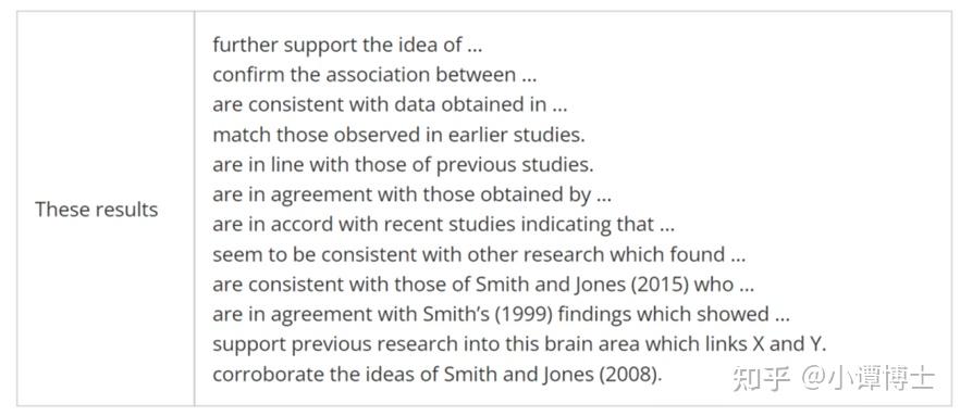
(4)引用前人的文献进行佐证
- 描述方法
描述完关键结果后需要引用前人相关的文献与本文的结果进行对比,以说明本文结果的合理性。
- 句型模板
二、 折线图
折线图可以显示数据随时间(或浓度、密度、高度等)而变化的趋势,非常适用于显示数据在相等自变量间隔下的趋势。

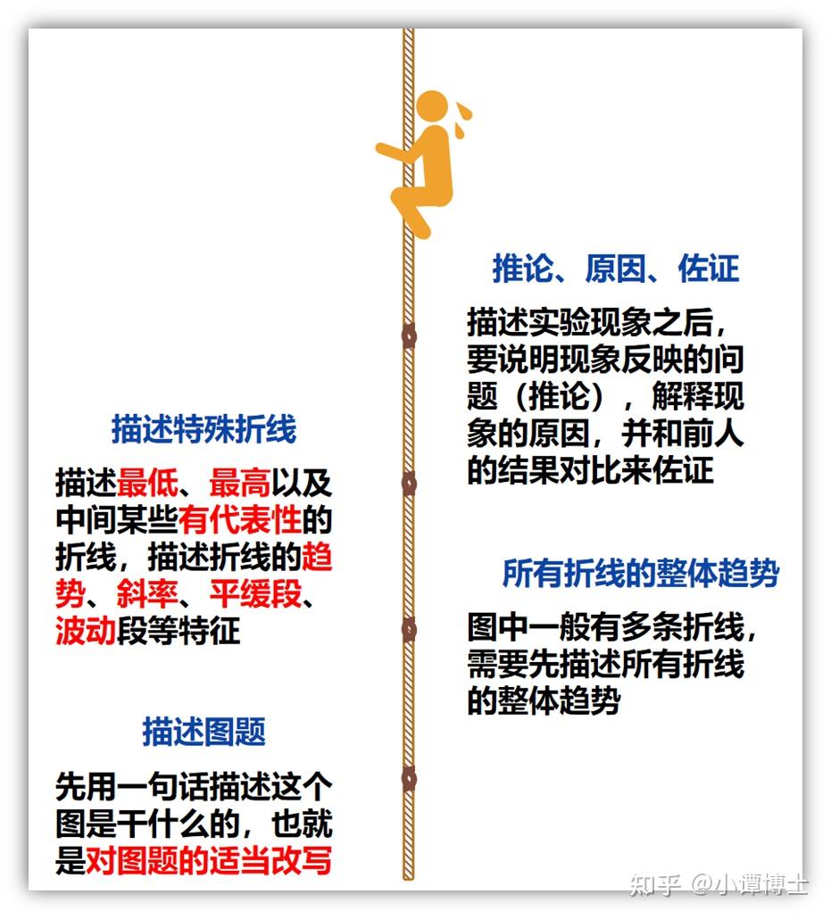
1、描述逻辑模板
(1)描述图题
先用一句话描述这个图是干什么的,也就是对图题的适当改写。
常用的句式:Figure 1 shows that...或者... are shown in Figure 1;
(2)描述所有折线的整体趋势
图中一般有多条折线,需要先描述所有折线的整体趋势。
(3)描述特殊折线
描述最低、最高以及中间某些有代表性的折线,描述折线的趋势、斜率、平缓段、波动段等特征。
(4)描述推论、原因、佐证
描述实验现象之后,要说明现象反映的问题(推论),解释现象的原因,并和前人的结果对比。
2、 句型模板

(1)描述变化趋势

(2)强调图表中趋势
(3)描述(最)高点和低点
Production of X peaked in 1985.
X rose to a high point and peaked in …
The peak age for committing a crime is 18.
The number of Xs reached a peak during …
Production of X reached a low point in 1990.
The rate fell to a low point of $5.00 at the end of the year.
(4)描述分数
Over half of those surveyed indicated that …
Nearly half of the respondents (48%) agreed that …
Approximately half of those surveyed did not comment on …
Less than a third of those who responded (32%) indicated that …
The number of first marriages in the United Kingdom fell by nearly two-fifths.
Of the 148 patients who completed the questionnaire, just over half indicated that …
(5)描述比例
Singapore has the highest proportion of millionaire households.
The annual birth rate dropped from 44.4 to 38.6 per 1000 per annum.
The proportion of live births outside marriage reached one in ten in 1945.
Scotland had the lowest proportion of lone parents at only 14 per cent.
The proportion of the population attending emergency departments was 65% higher in X than …
(6)描述百分比
70% of those who were interviewed indicated that …
Since 1981, England has experienced an 89% increase in crime.
The response rate was 60% at six months and 56% at 12 months.
In 1960 just over 5% of live births in 1960 were outside marriage.
Returned surveys from 34 radiologists yielded a 34% response rate.
He also noted that fewer than 10% of the articles included in his study cited …
With each year of advancing age, the probability of having X increased by 9.6% (p = 0.006).
The mean income of the bottom 20 percent of U.S. families declined from $10,716 in 1970 to …
X found that of 2,500 abortions, 58% were in young women aged 15-24, of whom 62% were …
(7)描述平均值
The average of 12 observations in the X, Y and Z is 19.2 mgs/m …
This p can be seen as the average life expectancy at various ages.
The proposed model suggests a steep decline in mean life expectancy …
Roman slaves probably had a lower than average life expectancy.
The mean age of Xs with coronary atherosclerosis was 48.3 ± 6.3 years.
Mean estimated age at death was 38.1 ± 12.0 years (ranging from 10 to 60+ years)
The mean score for X was subjected to multivariate analysis of variance to determine …
The mean income of the bottom 20 percent of U.S. families declined from $10,716 in 1970 to …
(8)描述范围变化
Estimates of X range from 200,000 to 700,000 and up to a million or more.
The respondents had practised for an average of 15 years (range 6 to 35 years).
The participants were aged 19 to 25 and were from both rural and urban backgrounds.
Rates of decline ranged from 2.71– 0.08 cms per day with a mean of 0.97 cms per day.
They calculated ranges of journal use from 10.7%–36.4% for the humanities, 25%–57% for …
The evidence shows that life expectancy from birth lies in the range of twenty to thirty years.
At between 575 and 590 metres depth, the sea floor is extremely flat, with an average slope of …
The mean income of the bottom 20 percent of U.S. families declined from $10,716 to $9,833.
三、箱线图
线箱图主要用于反映原始数据分布的特征,还可以进行多组数据分布特征的比较,由最小值、最大值、第一四分位数、第三四分位数、中位数和异常值构成。
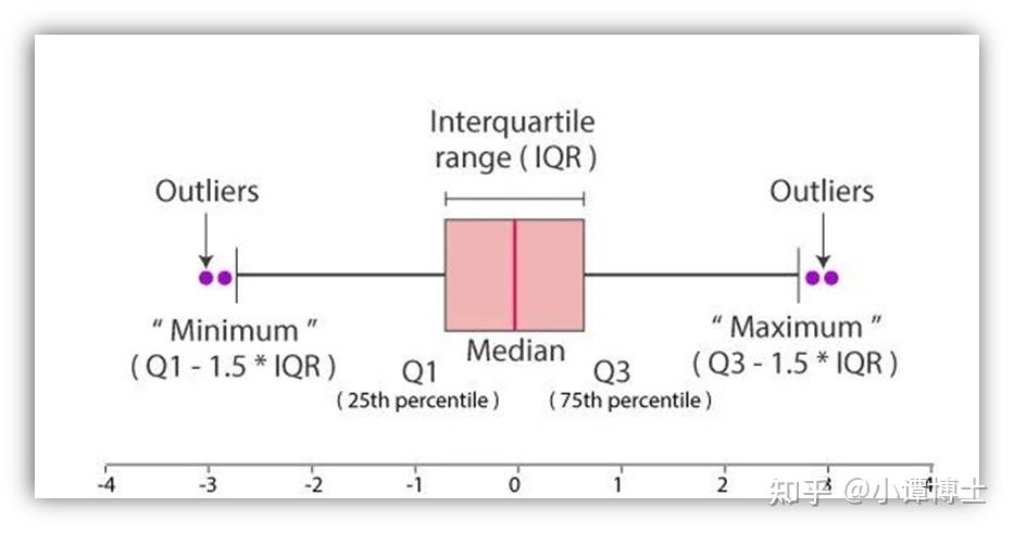
- 中位数(Q2 / 50th百分位数):数据集的中间值
- 第一四分位数(Q1 / 25百分位数):最小数(不是“最小值”)和数据集的中位数之间的中间数
- 第三四分位数(Q3 / 75th Percentile):数据集的中位数和最大值之间的中间值(不是“最大值”)
- 四分位间距(IQR):第25至第75个百分点的距离
- 离群值(显示为绿色圆圈):“最大”:Q3 + 1.5 * IQR,“最低”:Q1 -1.5 * IQR

- 正偏斜:如果从中位数到最大值的距离大于从中位数到最小值的距离,则箱形图正偏斜。
- 负偏斜:如果从中位数到最小值的距离大于从中位数到最大值的距离,则箱形图为负偏斜。
- 对称:如果中位数与最大值和最小值等距,则称箱形图为对称。
2、描述逻辑
(1)描述中位数
- 描述逻辑
一张图中会同时画多个箱子(多个类别),因此需要比较所有箱子中位数的变化情况。
此时和描述柱状图中柱子的高低变化的方法是是一致的,描述逻辑为:最高值、最低值、变化趋势、特殊值。
- 话术模板
直接采用描述柱状图的话术模板。
In Fig.10 there is a clear trend of decreasing …
The differences between X and Y are highlighted in Table 4.
From the chart, it can be seen that by far the greatest demand is for …
From this data, we can see that Study 2 resulted in the lowest value of …
As Table III shows, there is a significant difference (t = -2.15, p = 0.03) between the two groups.
It can be seen that A has the highest median value of(数值),follwed by B(数值), while the(指标)of C is the lowest(数值).
The line in the middle of the box plot for Study Method 1 is higher than the line for Study Method 2, which indicates that the students who used Study Method 1 had a higher median exam score.
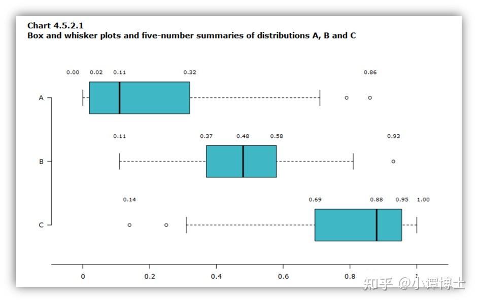
(2)描述偏态
- 描述逻辑
描述最大正偏态、最大负偏态、最小偏态以及无偏态这几个类别。
- 句型模板(以下图为例)
描述最大正偏态:The distribution A is positively skewed with the lowest median value of 0.11.
描述最小偏态:Distribution B is approximately symmetric, because both half-boxes are almost the same length (0.11 on the left side and 0.10 on the right side). It’s the most concentrated distribution with an interquartile range of 0.21, compared to 0.30 for distribution A and 0.26 for distribution C.
描述最大负偏态:The distribution C is negatively skewed with the highest centre of distribution (median is 0.88).
(3)描述分散性
- 描述逻辑
通过描述每个类别的IQR说明每个类别的分散性。和上文描述中位数和偏态逻辑一样,描述分散性最大和最小的类别,以及特殊的需要着重说明的类别。
The box plot for Study Method 2 is much longer than Study Method 1, which indicates that the exam scores are much more spread out among students who used Study Method 2.
- 模板提取
The box plot for (类别A) is much longer than (类别B), which indicates that the (研究内容) are much more spread out among (类别B).
The IQR of Group A is XX, which is XX% higher than that of Group B
Group A has the highest XX, which is 数值, follwed by Group B with an IQR of 数值, while Group C has the lowest IQR (数值)
(4)描述异常值
- 描述逻辑
描述异常值最多的类别,最少的类别,以及特殊的需要着重说明的类别。
- 句型模板
Group A generates/produces the most number of outliers (数量), while Group B has the least (数量)
All three groups include potential outliers. There are three outliers in Group A.
(5)针对实验现象的推论、原因、佐证
- 描述逻辑
该部分同样和其他类型的图表的描述逻辑是一致的。
- 句型模板
A possible explanation for this might be that …
This result may be explained by the fact that …
There are, however, other possible explanations.
According to these data, we can infer that …
These findings suggest that …
It can thus be suggested/indicated that …
The results are consistent with the data obtained in
The results aggreed well with those obtained by
Similar results are found by XX
 新公网安备 65010402001845号